
Methods Used:
Heuristic Evaluation, Competitive Analysis, Information Architecture, Wireframing, Prototyping, Mobile-First Design
Tools:
Figma, Notion, Google Fonts, Coolors
Overview
Sudarshan News is a prominent Hindi news platform delivering political, social, and regional news across India. While it has a dedicated audience, its digital experience was falling short and for younger readers expecting clean, intuitive interfaces. This case study outlines how I redesigned their homepage experience with a focus on readability, accessibility, and visual clarity.
The new design includes a dual theme approach, light mode for daytime reading and a visually comfortable dark mode for late night users.
The Problem
The original site (https://www.sudarshannews.in) presented a number of usability challenges:
Overwhelming visual clutter with minimal white space
Poor content hierarchy made it difficult to scan or prioritize news
Unoptimized mobile experience with dense layouts and overlapping UI elements
Inaccessible for older or low-vision users due to low contrast and small text
No clear content categories, making it hard to follow trending or localized news
The challenge was to redesign the site in a way that preserved the high-volume content nature of news platforms, while modernizing its layout and improving navigation.
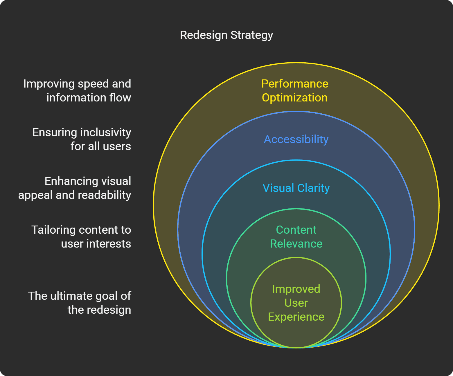
Goals
Help users discover the content most relevant to them (e.g., by category or region)
Provide light and dark modes to suit different user preferences
Create a cleaner, more trustworthy visual identity
Optimize the site for faster browsing and better information flow


My Process
Research & Audit
I began by conducting a heuristic evaluation of the original site and benchmarking it against Indian news competitors (like AajTak, NDTV, and ABP News). I also reviewed user feedback and observed how readers interact with high-volume content.
Wireframes & User Flow
The wireframes focused on reducing visual chaos:
Introduced distinct modular sections for categories (e.g., Trending, State News, Videos)
Designed a hero “Breaking News” bar to immediately capture top headlines
Added clear category filters for quick browsing (e.g., state-specific news)
UI Design
Created both light and dark modes for better accessibility
Used card-based layouts for easier scannability
Introduced clear section headers, iconography, and improved whitespace
Applied contrast-friendly typography for readability on both desktop and mobile

New Design Highlights
Modular layout: Clear separation between content sections (Trending, Big Stories, State News, etc.)
Regional tags: Introduced quick-access tabs for state-specific news (like Delhi, UP, MP)
Video hub: Dedicated layout for multimedia with larger thumbnails
Dual-mode design: Light for daytime clarity, dark for low-light comfort
Before vs. After
Element | Old Website | New Design |
|---|---|---|
Navigation | Overloaded, no content grouping | Clear tabs & filters with region tags |
Content Readability | Dense paragraphs, small fonts | Proper font hierarchy and line spacing |
Visual Identity | Outdated, cluttered | Clean UI with modern layout principles |
Theme Options | None | Light + Dark Mode |
Video Display | Hidden in grid | Featured with dedicated carousel layout |
Impact (Projected)
While this redesign has not yet been deployed live, based on usability heuristics and prior benchmarks:
Expected bounce rate reduction of 25 to 30%
Anticipated increase in session duration by highlighting personalized and regional content
Higher repeat visits from night-time readers due to dark mode
Improved mobile engagement through responsive, card-first layout
Learnings
This project reinforced a key insight:
“In content-heavy environments, clarity is conversion.”
Redesigning a news platform isn't about removing content — it's about presenting it intelligently. The balance between density and digestibility is critical. By modernizing the UI and adding visual breathing room, even a traditional channel like Sudarshan News can feel fresh and accessible to a digital-first audience.